


Your dashboard has numbers. Plenty of them. But by the time one turns red, the problem it shows already happened weeks ago. You weren't warned in time to act, you were just informed after it was too late.
That's not an execution failure. It's an architecture failure. Most dashboards measure what already happened, almost none measure what's about to happen. A lagging KPI doesn't warn you, it only confirms.
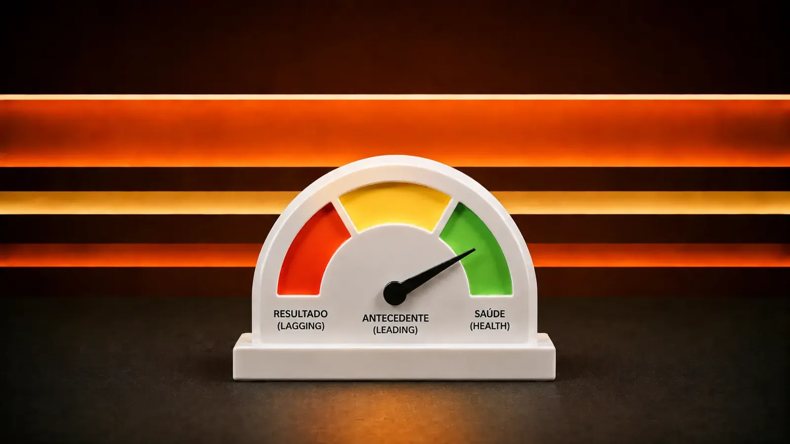
Every indicator falls into one of three categories: lagging, leading, and health.
Why AI spots the blind spot in your dashboard
You look at your own KPIs every day, so they feel complete just by being there. AI looks at the whole list at once and classifies each item into the three categories, without that visual habit. If seven out of eight KPIs are lagging and none are leading, that's obvious to it on the first pass, even if nobody on the team noticed.
The method behind this is simple: list the KPIs you already track. Mark each one as leading, lagging, or health. Wherever an entire category is empty, that's where the dashboard is blind.
A dashboard with no leading indicator only records what already happened.
The prompt that builds this framework for you
Asking AI to "suggest KPIs" returns a generic list, with no category and no bar for good versus bad. The prompt needs to force the three categories and a clear bar for each indicator.
I need to design a KPI framework for [team or function]. The structure should cover:
1. Two or three leading indicators that predict future performance.
2. Two or three lagging indicators that confirm the result.
3. One or two health indicators that prevent chasing results at the cost of team wellbeing.
For each KPI, specify: how it's measured, where the data comes from, how often it's reported, and what separates a good result from a concerning one.
Team or function: [describe]
KPIs we already track today, if any: [list]
Run this for a sales team, and the output looks something like this:
Leading indicator: proposals sent per week.
Measurement: direct count in the CRM. Cadence: weekly.
Good: 15 or more. Concerning: below 8 for two weeks in a row.
Health indicator: average overtime hours at month-end close.
Measurement: time tracking. Cadence: monthly.
Good: stable. Concerning: sustained increase even when the target is hit.
Why this mapping works
The prompt works because it forces AI to fill all three categories instead of stacking metric on top of metric. If the team can't list its own KPIs from memory, that's a sign there are too many. The sweet spot is five to seven total, and that's exactly what the two-or-three-per-category limit forces in practice.
Paste the list of metrics you already track today, and the answer gets even more precise: AI isn't suggesting from scratch, it's pointing out exactly which category is empty in what already exists.
Before adding one more number to the dashboard, it's worth asking what it actually measures: what already happened, what's about to happen, or the price being paid to get there. If all three answers don't show up together, the dashboard is incomplete, no matter how many numbers it has.
Comments (0)
Comments are moderated and if they violate our Terms and Conditions of use, the comment will be deleted. Persistence in violation will result in a ban of your account.